
Yoon Lee
AI-based designer &
Researcher & Practitioner


Modernized Premium CNC Controller for Industry 4.0HYUNDAI-ITROL+ is a 19-inch touchscreen-based CNC controller developed for Hyundai WIA machine tools, designed with a minimalist concept featuring simple lines, clean curves, and a combination of monotone and silver tones. Key design elements focus on intuitive and user-friendly operation, with both bar-type and folder-type controllers developed from ideation to mass production. This project was part of a national research initiative and led to mass production, design patent applications, and recognition with a PIN UP Design Award.
The "Quick Function Bar," a key design element of the HYUNDAI-iTROL+, allows users quick and intuitive access to essential functions on the machine via a favorites list. With simple operations, users can start and stop tasks by accessing the diagonally arranged quick menu, and they can also operate the controller quickly while holding the ergonomically designed white grip.
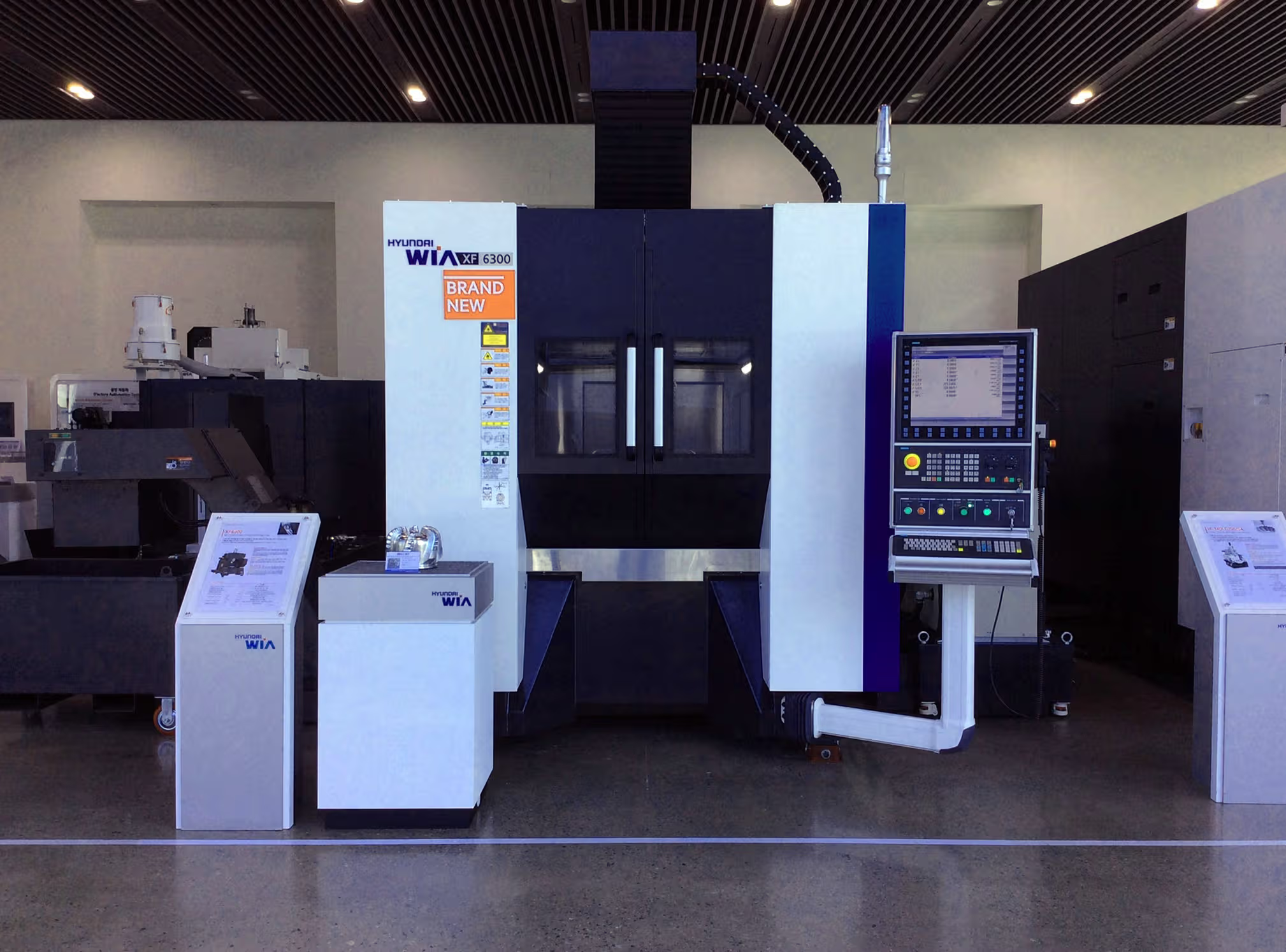
The controller's keyboard is designed to simplify user movements, minimizing user errors and interference even during complex tasks. The built-in LED control dial allows users to make precise adjustments even in dark working environments or while wearing gloves. Additionally, the interaction-based GUI provides not only information about the machine and model status but also solutions for immediate responses. The GUI is systematically structured to layer information, enabling users to quickly grasp information and perform tasks without errors.

The GUI of HYUNDAI-iTROL+ aims for functional design through a clean layout, clear separation of information layers, and consistent use of visual language, allowing users to interact immediately with the machine via the controller.


Noise fatigue in the ICU: platform for sound data collection and visualization (2019), Master Graduation Project, TU Delft, Integrated Product Design specialized in Medesign, Industrial Design Engineering

Social robot for oldder adults (2018), TU Delft, Applied Ergonomics and Design Proejct for Van Breda,Group project, responsible for the 3D & and visual design

An Appcessory Design For Preventing Drowsy Driving: (2015)Bachelor Graduation Show, Industrial Design Department, Hongik University

Entertaining educational AR experience for children in a Ford autonomous car in 2030 (2018), TU Delft, Advanced Concept Design Proejct for Ford Research and Innovation Center, Germany
In-house Project for Hyundai WIA Corporation (2016); 2017 CommIn Charge of Hardware Design and GUI Guideline